Group 3.5 CPSC 481 Fall 2019
Index
Report
Introduction
We are group 3.5, and the app we developed was U of C Mingle - a social network intended to connect students with club events around the university campus. It is intended to bring a more user-friendly interface than ever seen before on campus.
Design Problem
The crux of the project involves responding to the problem of how to inform and engage students about events going on around campus (especially club events). The target users of the design were thus students, who would use the app to be informed, club executives, who would use the app to inform them, and the administrators who monitors events and clubs.
End-users and Stakeholders
The end users of the app will be students and club executives.
- Students would be able to discover new clubs and events or find other students who have already joined clubs they are interested in. They would be able to personalise the application so that it would give them information and notifications on clubs they are following and events they are interested in going to.
- Club executives would be able to add and modify club information more easily, as well as organize club events. The application benefits them by having all the information about their club and events in one application, as well as having it easy to find for students who are interested in what they do, but are not part of the club yet.
The stakeholders of the app are the University’s administration, as well as its end users. The administration must be able to apply certain constraints and to an extent monitor certain aspects, while keeping a fun experience. </p>
User Research and Findings
Interviews - We were able to get direct feedback from five people through structured questioning. We asked six questions related to clubs and events on campus to gather attention as to how the end users find the current experience and how we could improve it. We found that although not everyone interviewed was already part of a club, they were all interested in searching for and joining clubs and events. However, at the moment, there are a lot of problems and difficulties that they face when trying to do so, mostly due to lack of publicization. Not all of them were satisfied with how they get information about clubs they are a part of as well, either due to disliking the platform being used or the accessibility of the information.
The interviews went really well, and most people gave us more information that was not part of the question but which was also valuable and helpful, and it seemed like the end users were all giving their genuine thoughts on the matter. However, the interview questions themselves could be improved and structured better, as sometimes, some of the answers we received overlapped with another question which rendered the second question useless, hence it was repetitive and unnecessary. That question could have been replaced with a different one that could garner a different aspect of clubs and events that people may not voluntarily say from the questions at hand, or perhaps, a question about possible design choices, such as whether they like the university’s colour scheme of red and yellow.
From the interviews, we were able to establish that the most important aspects of the app to build was organisation, simplicity and ease of search, which we will base our designs on.
Secondary research - We mostly learned about the idea of a ‘gamified’ interface and its usefulness in engaging users of similar apps. Overall, there were studies that supported the idea that such an interface would indeed be effective. Rationales included a high population of gamers among university students, the preference for a reward system, and the fact that virtual rewards are still effective. While the ‘gamification’ is abandoned, parts of the research still affected the design. Our stage two report has additional information about the interviews conducted as well as references to the secondary research.
Design and Justification
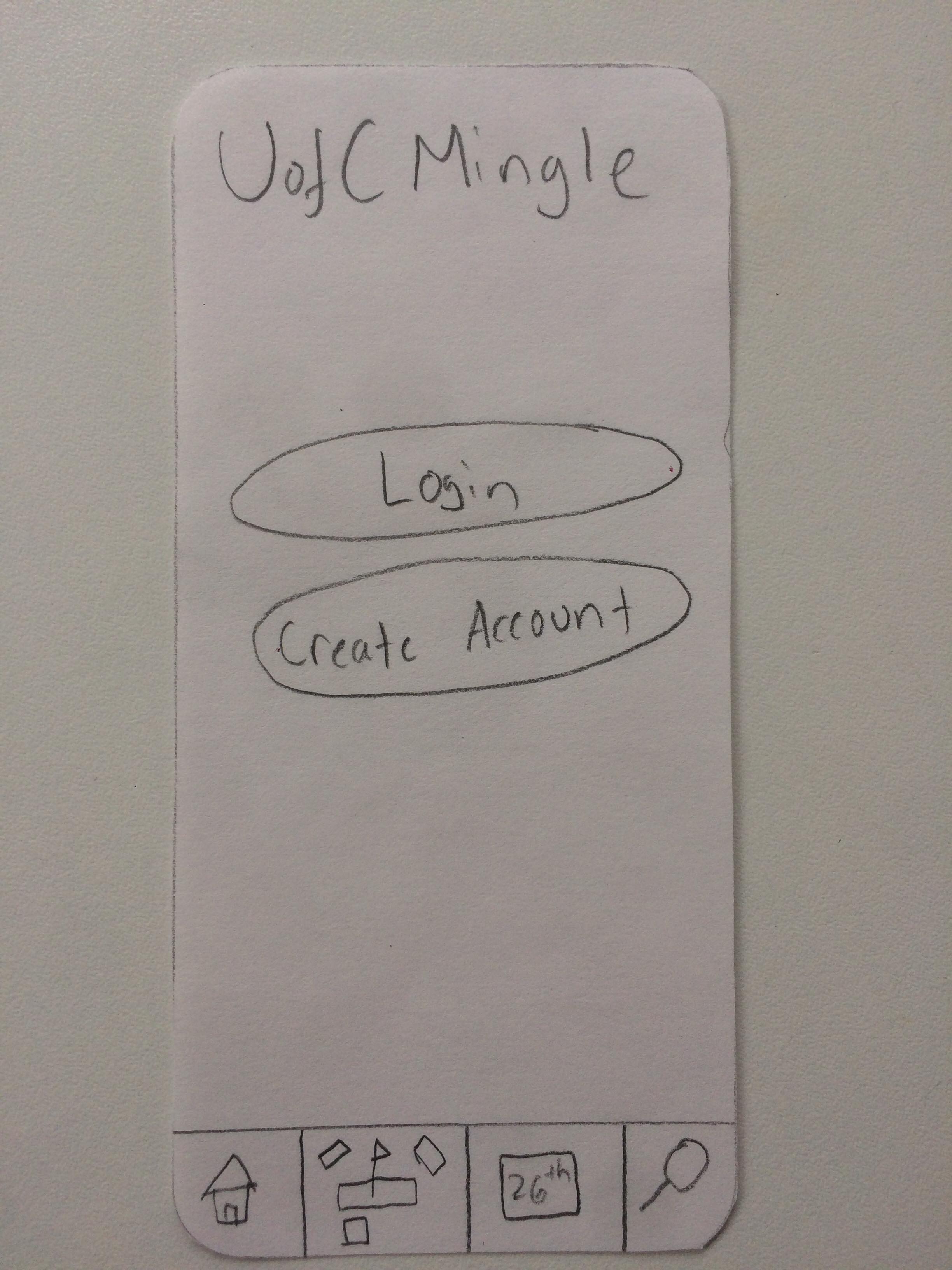
Some of the important parts of the current design:
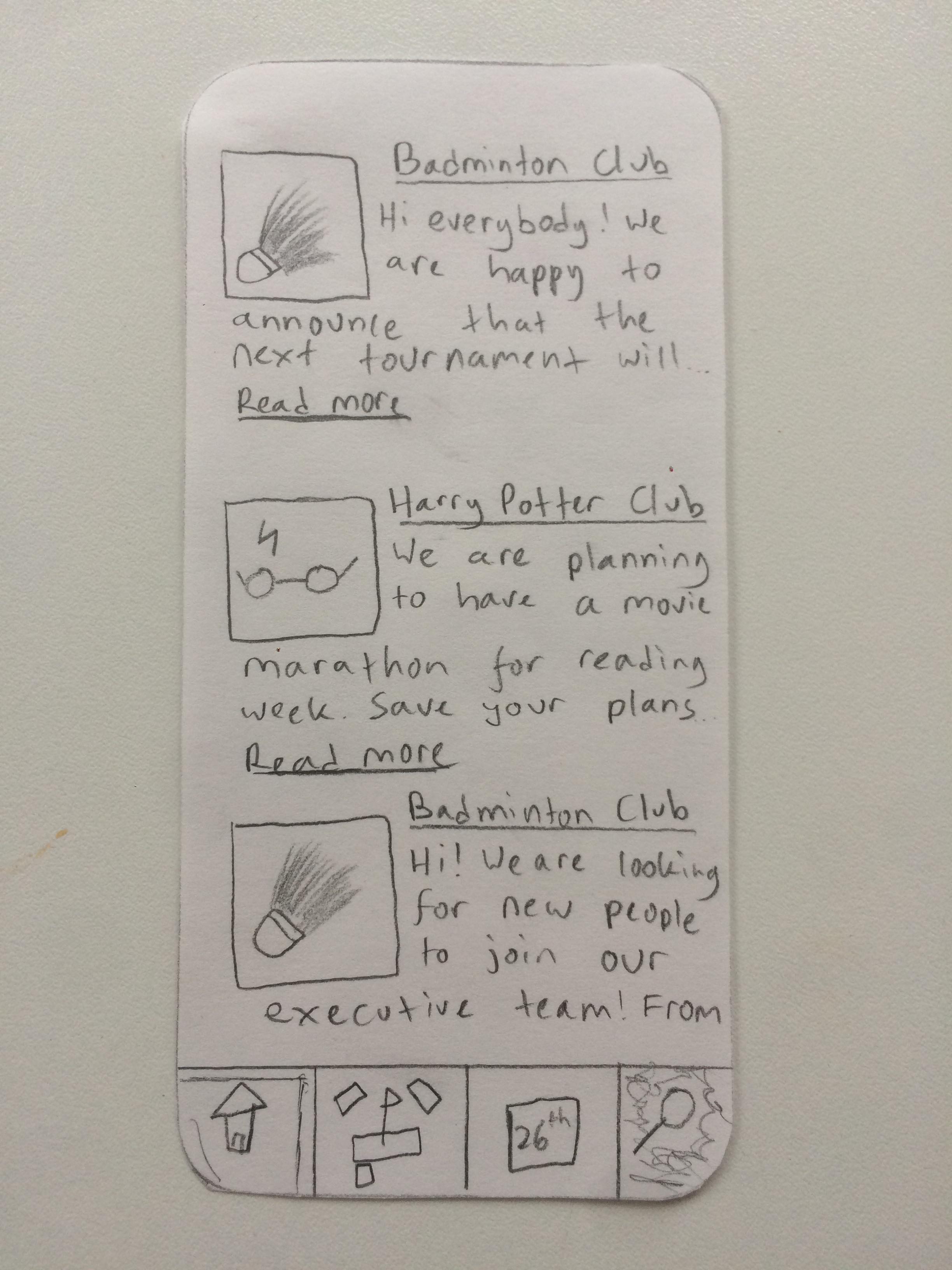
- A home feed for bringing all personal news into one column
- The idea behind this is to aggregate the most important information that the user has not yet seen into a single screen that is immediately presented to them. It compiles all the information of different clubs into one screen for the user to easily access and read.
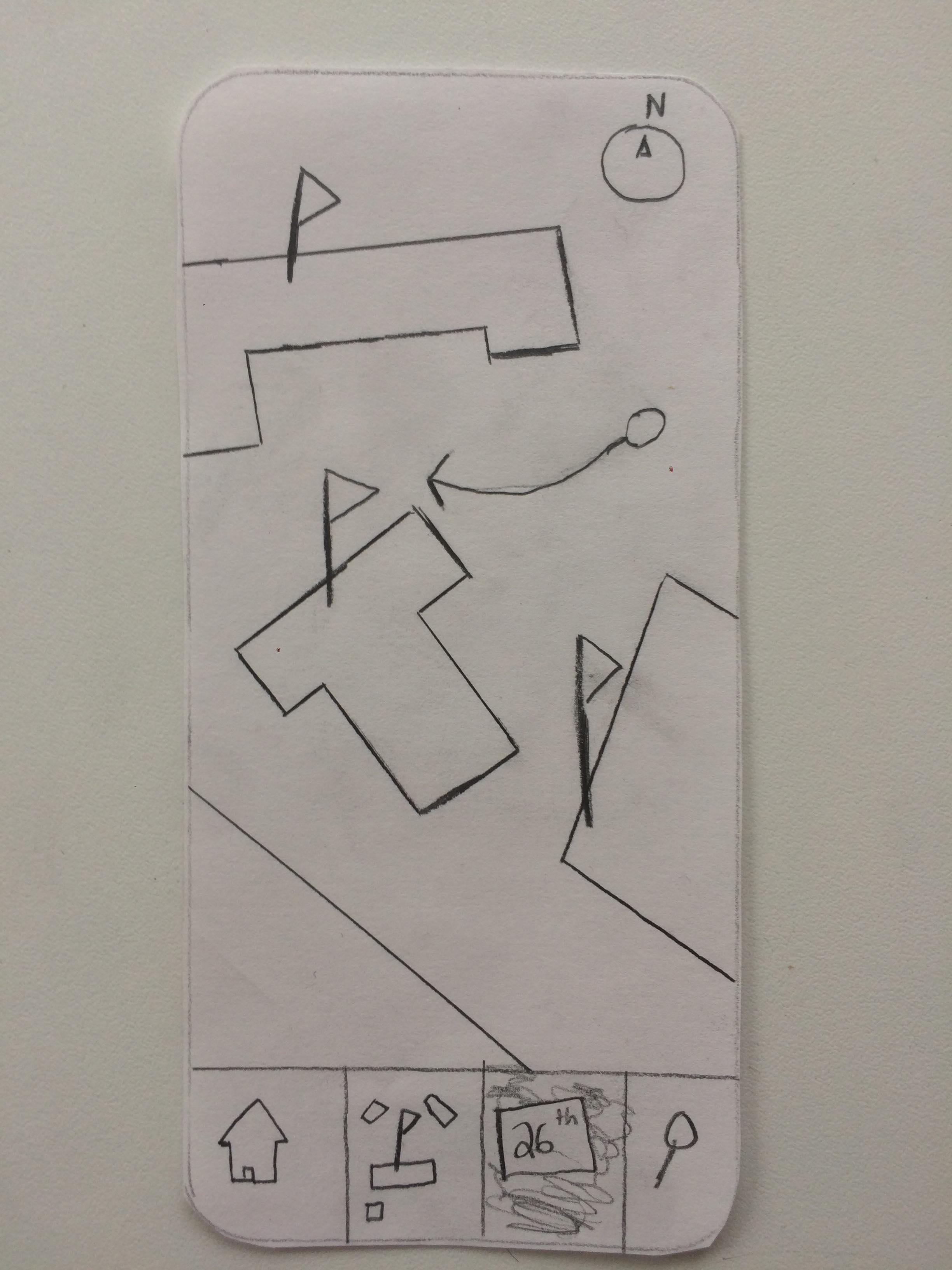
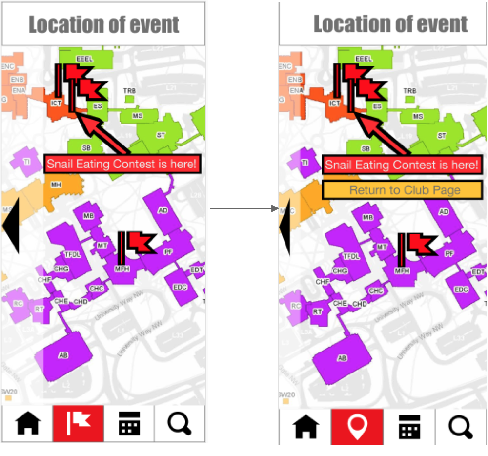
- An interactive map to display the locations of the events that you have added
- This gives the user feedback to let them know where events are happening (including in relation to each other) and helps them to navigate the campus. It visualises where the location of the event is for a quick idea of where the user should head towards.
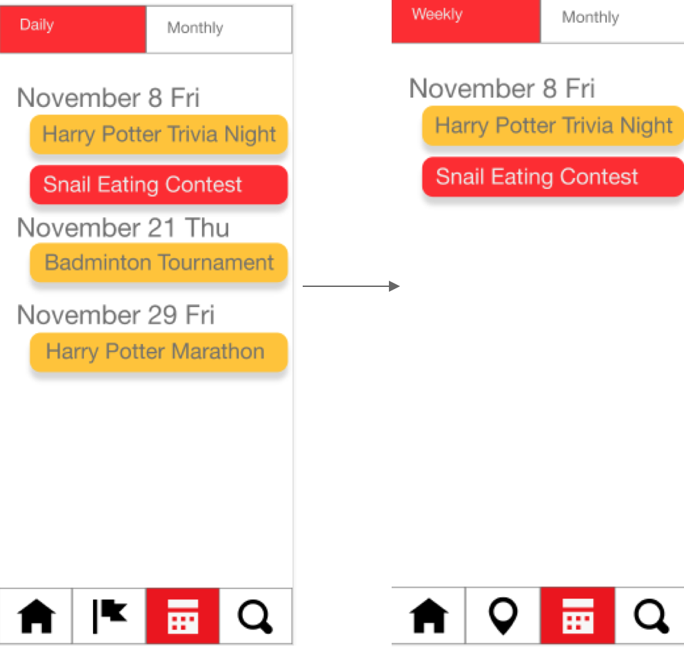
- Both a monthly and a weekly view for your personal upcoming events, as well as general events around campus
- This calendar is a central feature which not only lets users know when events that they have selected are happening, but also helps them discover new events according to their own schedule.
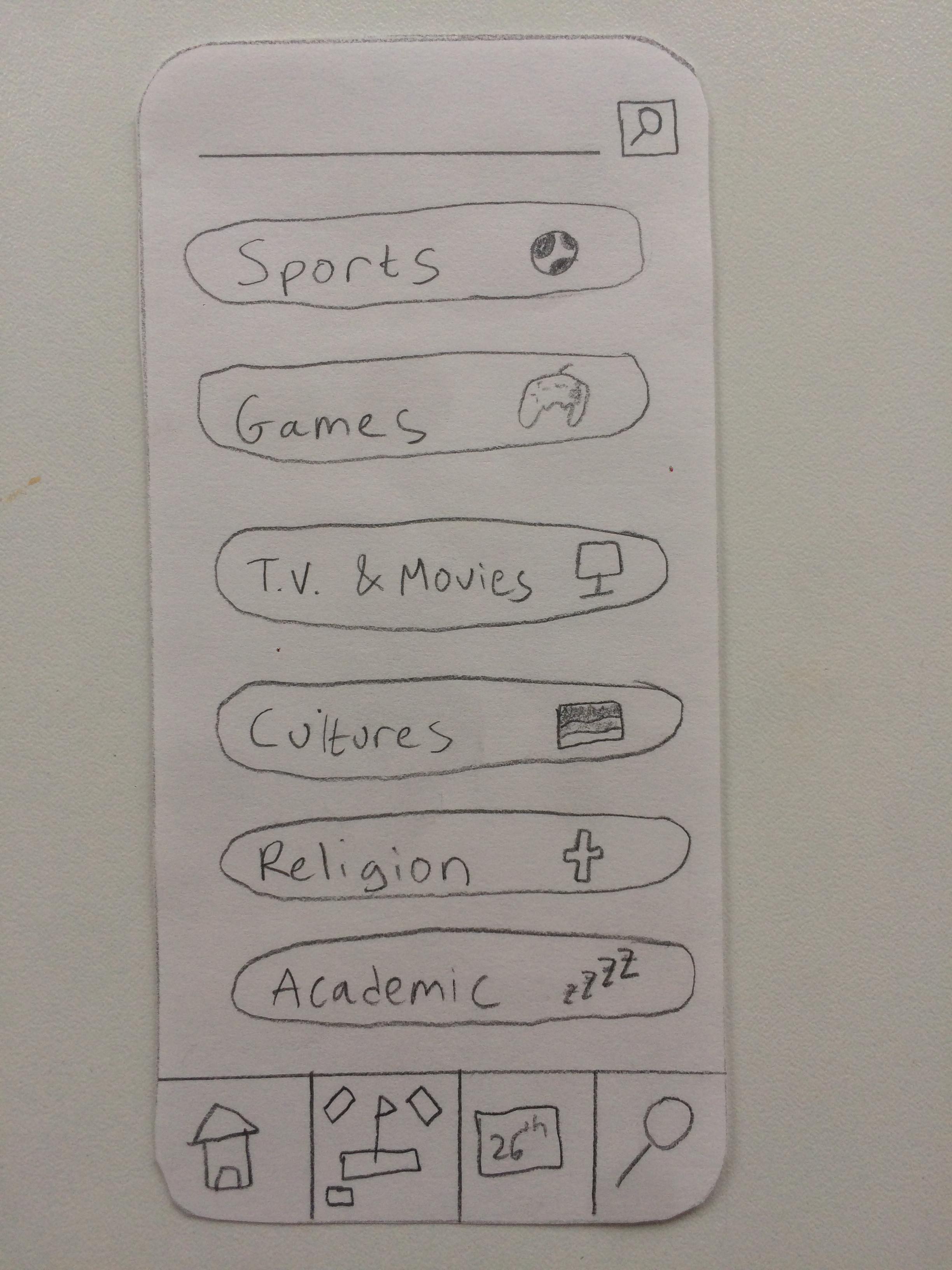
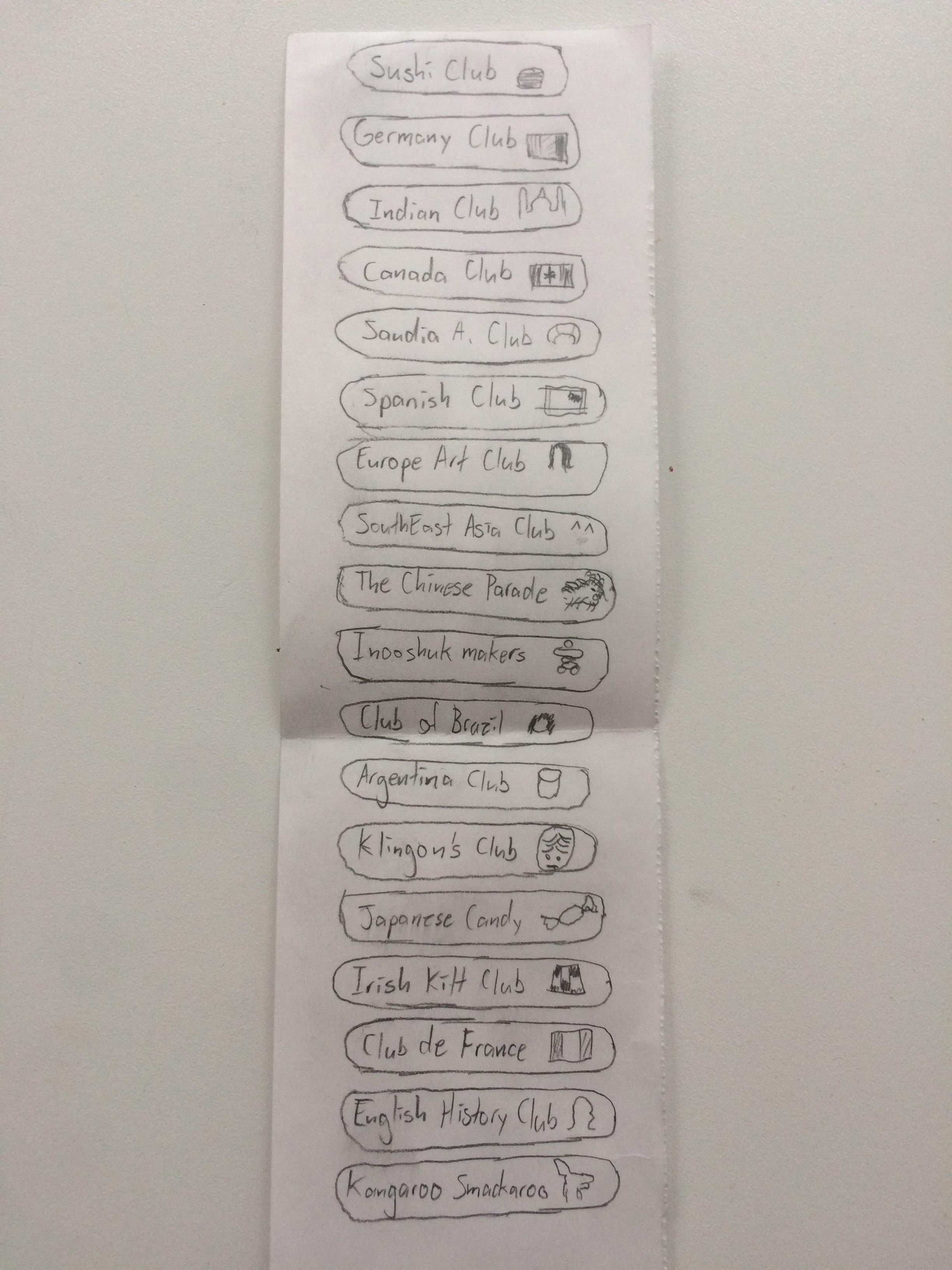
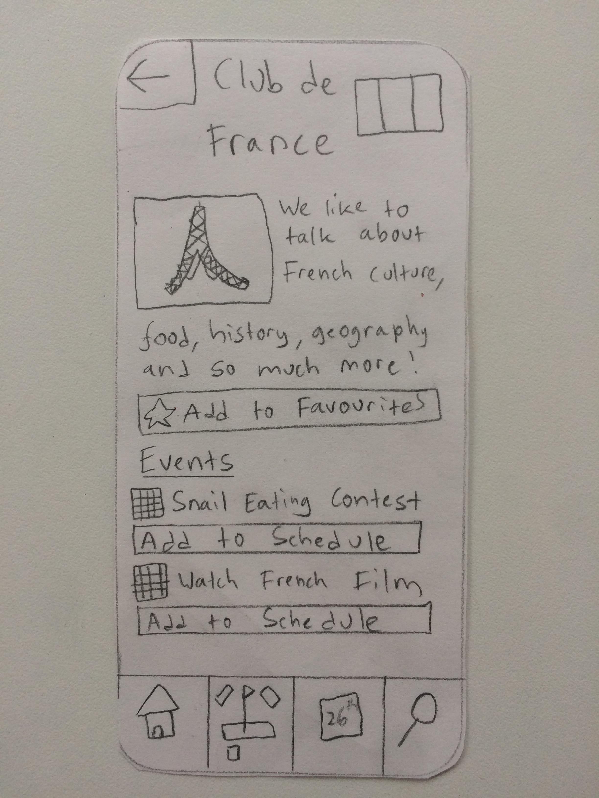
- A categorical search system for finding clubs, as well as a keyword search function
- This feature helps users to get info about and subscribe to clubs that they already know they’re interested in (or to find these clubs according to their categorization), rather than just looking through a list of events. It makes it easy to find clubs that are similar to that of what they like as well with the categorisation.
- Personal profile to keep track of your past and current clubs
- This facilitates another aspect of the personalisation feature of the application. It allows the user to see the clubs they are subscribed to and also events they attended in the past, for references in case they wish to attend something similar in the future. Also, it helps the user to organize and modify important information that can change the way other features work.
- A friend system to see what they are up to on campus
- We wanted to make it easy for users to find out what their friends are up to on campus. It was decided that this would be limited to friends being able to view and follow each other’s public activities, as additional features would dilute the experience (and there are plenty of social applications already). The presence of too many features that duplicate functionality in other social media apps (like messaging or other ways of communicating with friends) could easily complicate the way users interact with the app, and distract from its central features in a way that would take away from the overall user experience. We modelled this based off of Spotify, as you are able to add friends to see what music they are listening to, but cannot messaged them on the application. It helps keep the focus on clubs and events rather than on being a messaging application.
An idea that was scrapped was a game-like set of interactions and interface for the application, based on the old ‘LevelUp’ program. We thought that this feature would be helpful to encourage the use of the app, but it was of secondary importance compared to the major functionalities and UX features that we decided to focus on instead.
Affinity Diagram
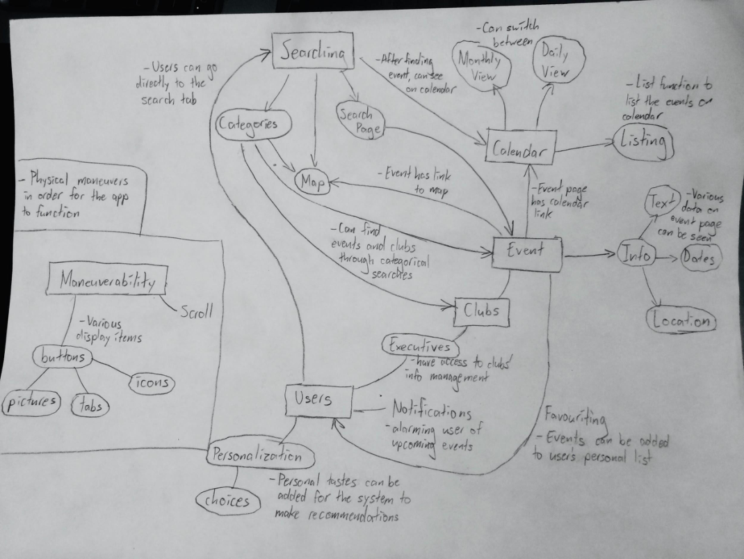
Sketches
Heuristic Evaluation and Findings
We worked with another group and traded our prototypes to test out and give heuristic evaluations on. We received a lot of helpful feedback, which outlines what works really well in our application, but also what was needed to improve on.
The most critical problems that we received from the feedback iinclude bug fixes regarding which buttons can be pressed and where they lead - for instance, being unable to press the home button, or the back button not leading to the proper screen. Another critical issue is matching between the system and the UI. In one instance the flag icon didn’t intuitively represent the map. One case of confusion also lied in the calendar tab as it was split between daily and monthly where daily showed monthly information but in list form as opposed to calendar, which was unexpected to the testers. The profile settings button was placed in an uncomfortable area to click on and the title of profile settings did not really match with the page it leads to, as it did not feel like a settings type page.
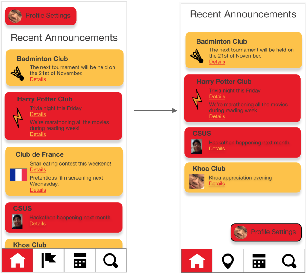
There were a number of criticisms that we decided were important, but could wait to be improved in the final product. In regard to flexibility and ease of use, the other group suggested that the app lacked features to make it easier for power users to navigate it more quickly. We’re considering ways that we might be able to do this in the final situation because we think it would require more thought than easier-to-fix and more critical issues. They also suggested that our “recent announcements” page, which currently serves as a main feature, might be more useful as a smaller set of a larger feature (perhaps like a list of all announcements). This is another less critical feature that we can evaluate and look at implementing in the final deliverable.
One critique of our aesthetic design came from our TA Brandon, who suggested that our colour scheme of red and yellow, while relevant to the University’s colours, might not be the best choice from a usability/aesthetic perspective, and that we might look into more gentle colour schemes. This is a big part of the app’s experience but doesn’t immediately affect its usefulness, so we’ll save any changes for the final deliverable.
For many of the heuristic points, the other team’s feedback was positive and praised our app for its usability and intuitiveness, apart from some of the bugs already outlined. The functionality of the app worked well to show the user where they are and what they did, a user could search up a club on name or via categories that applies to a club. As well as holding very consistent standards that many other apps do (visually with the choice of symbols used and in the general layout and locations for most of the buttons) which made the app easy to pick up and learn to use without needing training to do so. In addition there was no apparent major bugs or severe errors in the prototype that could cause an interruption in the workflow.
All in all, the app was easy to pick up and learn with adjustments needed to better suit a user with more experience with apps as well as making it more visually consistent.
Resulting Design Changes
We changed our designs based on the feedback we received from the heuristic evaluation, as well as other people such as our TA, Brandon.
We resized some of our buttons, for example, in the map page. The button on the map page to go right or left was too big and unnecessarily blocked more of the map than it should, hence it was made smaller.
Our map icon for the navigation bar did not match with what other apps use or what people are used to, which breaches the match between the system and the UI. We changed it to a map pointer icon that is used in the majority of applications including Google Maps.
The daily calendar did not reflect what the users thought it would be and we had to change what the page presented. Initially, it showed events in the month, but in a list style that is easier to read than small texts on a monthly calendar. The users thought it would only show events that are happening on the current day. We decided to change it to a weekly calendar instead, as a daily one would look empty on the page, and proceeded to delete the events that were not happening on that week.
The profile settings was placed awkwardly on the page, as it was uncomfortable to press by being on the top left of the screen when your thumb is usually nearer to the bottom left, hence we simply moved the button down. We also changed the name to ‘View Profile’, because in our evaluation the users felt like it was not really a settings page.
The colour scheme we chose initially matched that of the university’s colours to keep it consistent as well as present that this application is specifically for this university and its students. However, we received feedback that the red and yellow used was not very aesthetically pleasing. Both colours were very bright and strong and did not complement each other well. Additionally, we had alternated between the colours when presenting lists, however this may create a sense of similarity in the buttons that had the same colours for the users, which is not true when simply listing out clubs or categories, they have no relations to each other. Since the red was also darker, we had to alternate between font colours which creates more inconsistencies. In the end, we changed our colour scheme to that of gold and pale yellow. The font colour was able to stay as one colour of a very dark shade of grey and we did not implement alternating colours when listing. We kept using a paler shade of red for buttons that resonates with ‘removing’ or ‘cancelling’ to match with the system and UI as it is what people are familiar with.
One of the features of our application is that you can view a personalised calendar or view the general calendar and see all events that are happening in the month. It was suggested in the evaluation that there should also be a general newsfeed or announcements as well, hence there is now a button ‘Show All’ in the homepage to switch between the features.
Changes after our Heuristic Evaluation
We moved the position of the profile settings button to allow easier thumb access.
We changed the name of the "daily" button to "weekly" to better match its function.
We added a back button to the map page to allow easier navigation and unify with the rest of the UI.
Recommendations for Next Iteration
As the gamification of the app was dropped due to the overall time investment required to implement the features, had there been more time to do another iteration we might have implemented it. Such features would include a point system for attending events around campus, which can then be converted into rewards or prices, providing users with a bigger sense of pride and accomplishment for contributing to their clubs.
One of the aspects to have when implementing the application was ease of search. We have successfully done that with title and categorisation searching, however we can take it one step further. As of now, each club belongs to one category. This is alright, however, clubs like ‘Aikido’ is able to fit under two categories of Sports and Culture. One might argue, that it should be under a new category that we did not implement, such as ‘Martial Arts’. Hence, for the future iteration of design, we can implement ‘tags’ for clubs to have and to ease searching even further. A club will be able to have multiple tags that best suits their description. For example, ‘Aikido’ will be under the sports category, but it can have the tags ‘martial arts’, ‘japan’, ‘self-defence’, ‘culture’, ‘workout’ and more. This will make it easy for people to search if they know what the club is about. It also prevents a user from selecting a category and having to scroll through tens of clubs to find what they are looking for.
Users may often make mistakes when carrying out actions, such as adding or removing things in the application. The user might accidentally add the wrong friend or accidentally rejected an incoming request from a friend. Hence, for future implementations, we can add a confirmation dialog box when doing such actions, just to double check with the user that it was not a mistake that they pressed the button.
Another feature that was suggested in the heuristic evaluation was to make the app faster and more efficient for “power users”. We weren’t sure how this could be accomplished in the context of our current working prototype, but if we were to continue with the design it would be useful to go to the investigation stage and ask potential power users what sort of features they might like to see.
Conclusion
We managed to create an aesthetically pleasing and useable final prototype that accomplished most of the goals outlined in our original idea. With each iteration we were able to refine our ideas in response to feedback from our teaching assistant and from our peers.
For the most part we found it easier to nail down useability and functionality before aesthetic design. For instance, our high fidelity prototype was generally well received in its heuristic evaluation regarding the features and ways the users interacted with the system, but our choice of color scheme, and the look of some elements (like the rounding of buttons) continued to be modified until the final iteration.
As noted before there are some features, especially gamification, that would have been implemented ideally, but overall we are proud of the final product we created with user centred design.
Stage Deliverables
Stage 1
Team ContractStage 2 - Investigation
ReportStage 3 - Sketching/Ideation
ReportPowerPoint
Stage 4 - Prototytping
ReportPowerPoint
Stage 5 - Final Product
ReportPowerPoint